Character Design Project: Post 1

For the character design project, all the Studio 1 students were split into 4 groups. The goal for this project is to create a 3D lineup of an entirely new cast of characters for a certain cartoon series that is being adapted into a spin-off mobile game. The characters we make have to be comprised of between 500-1000 triangles and two 256×256 pixel images for the texture.

The first task we were given as a group is to actually decide on what cartoon we would be following in this project, and we decided on Gravity Falls, which I was really happy with! Each member of the team decides on, designs, and models their own character.

We all told each other what kind of character we were going to design in week three, which was a bit later than the other teams because of a few of us (eg. me) didn’t share on slack what our ideas were, but after that we had a good idea of what everyone was tackling. I was still deciding between a werewolf or a child character at this stage, but after finding out a lot of people we doing small or child characters I chose the former for variety.

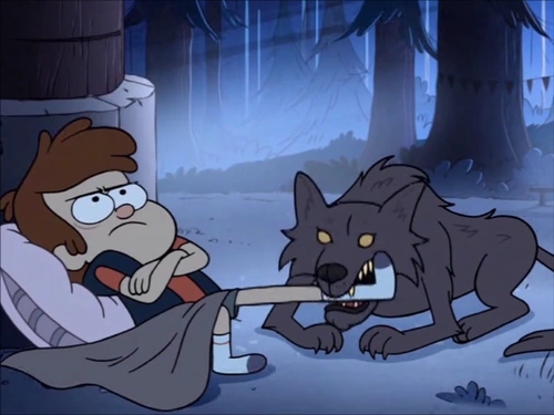
Next to do was some visual style research! Surprisingly, there’s actually not that many instances of wolves in Gravity Falls as of yet. The two examples I did find include Dipper being mauled by one, and Dipper forcefully dressed up as one. In the first image, the wolf is depicted as being browny-grey and very scruffy, with small, far apart yellow eyes. The second image tells us very little about the actual style of wolves in the show, but does give a good example of how to depict the texture of fur. Also I felt I needed more than one example.

Kate

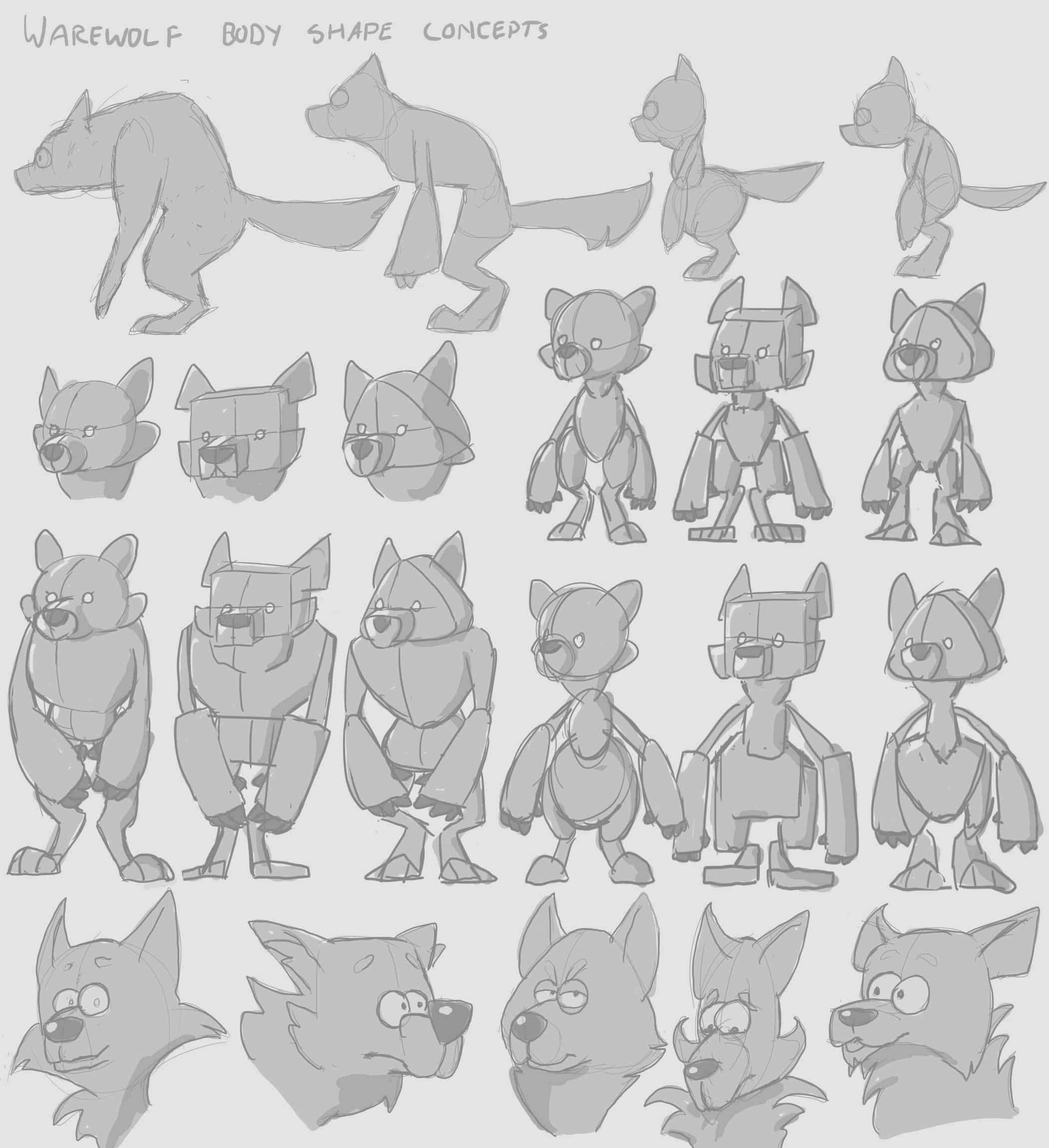
For the thumbnails I concentrated mostly on the body shape on my werewolf, as I felt it should be wearing minimal clothes and have a very limited colour palette. In the middle section I was trying out the idea of having smal eyes like the example of the wolf above but I decide that simply didn’t look ‘human’ enough to be a warewolf, so from then on I used the typical close-set circular eyes that Gravity Falls uses on all it’s humanoid characters. I stared to explore possible personalities in the row of heads at the bottom. I like the idea of having a grumpy, sleepy werewolf, who would rather go back to bed and sleep the full moon off than run around and cause havoc in a forest.

I got some great feedback from my facilitators and peers when I presented these thumbnails to the class! It was suggested that I make my character chubby, add more features to emphasize the sleepiness of the character, and generally have a more fleshed out idea of the personality of my character, which I believe I have since done! The idea of creating the human form of this character was also brought up, which I plan to design fairly soon.

bailey sketches

Here a some preliminary sketches of Bailey, the drowsy warewolf! Bailey is of no danger to anyone, unless you wake her up. That’s when you run. Besides having a horrible temper when her beauty sleep is interrupted, when awake Bailey is very mild mannered, and it takes a lot to get an emotional response from her. While being fairly dull, she is quite generous, especially when she can make someone feel more comfortable. This makes her very suited to her job as school nurse at Gravity Falls High School.

bailey

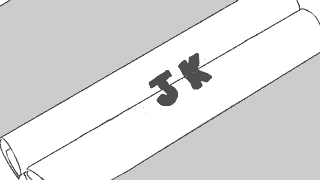
a wolf in sheep clothing, geddit????

Rapid Production Project: Post 2

Back to the Future & Typomad Title Sequence

Faffing around in Flash

In this post I will mainly be talking about what I did to create the animatic, as well as the feedback we received for it during our week 3 presentation. I managed to use up 8 hours doing this animatic, as a considerable amount of this time was consumed by was experimentation, learning stuff, and trying to fix issues in Flash.  I feel like the end product is just a series of somewhat-disguised quick and dirty workarounds, but it serves it’s purpose! I really learnt a lot about Flash and it’s capabilities (and shortcomings!)

Hoverboard

The first scene involves the hoverboard, which the camera zooms in on. The text Hover Board is wiped off to be replaced with initials, an the same happens again with another set of initials. To begin with, I had no idea how I could achieve this due to one main factor: The hoverboard must be opaque/solid so the schematics can appear under it for the transition. The reason the opacity of the board was an issue was because I was planning on having the two strips on the hoverboard transparent so I could animate the initials underneath it. So I did some research and decided to use a mask to solve this problem, so the layer with the initials was on top of the board, but could only appear on the two strips.

Red indicates where the mask is

Red indicates where the mask is

The animations of the initials sliding in were done with a classic tween. It was super useful and time-saving throughout the whole of this task thanks to it’s simplicity. I also used a classic tween for the zoom after scaling the three layers up, and then again for when it flies off screen.

Blueprint

I was starting to get the hang of things in this scene! The ‘written’ initials were done frame by fame but working backwards- I drew the whole set of initials first and then erased bits frame by frame to make sure they turned out how I wanted them to. The initials that slide on through the window were again done with a mask and a classic tween. The blueprints rolling inwards I had quite a lot of trouble with. Actually making the scrolling up animation was as straight forward as the previous ones, but it was hiding the blueprints behind them that had me scratching my head. I considered continuing the trend of using masks to solve all my problems, but I came up with a lazier faster idea of just adding a solid shape behind the scroll in it’s symbol so it covered what was underneath it and I didn’t have to do any extra animation. I did the initials that meet in the center of the scrolls frame by frame but it happens so fast you can hardly tell anyway.

flux-capacitor

This is where I included Pats suggestion of using the scrolls to transition to the flux capacitor.

I immediately regretted the idea of adding solid shapes behind the scroll when I got to the beginning of this part. When the other scroll rolls quickly in, it’s supposed to wipe to the flux capacitor, but because I used a solid shape to hide the blueprints, this now got into the way of the transition to the flux capacitor if it was on a lower layer. Masks came to my rescue again, though I feel this was my most abusive use of them yet.

biggassmask

Check out this monstrosity

So again, I put the flux capacitor on a layer above the scrolls and added a mask which covered the entire stage, then tweened the mask to animate in time with the scrolls. I had to add the extra part on top because when I tried to pan upward to the clock, I discovered most of it was missing, and eventually realised it was because of this mask. For the speeding up lights in the flux capacitor I made a long line of blue dots that got closer together at one end to form a line, then applied a mask to it on the the glass tubes, then tweened the line moving toward the center. I repeated this for the other two tubes.

The lights without the mask

Next I tweened a pair of initials to ‘charge’ into existence by editing its opacity in the keyframes. My team leader wanted the flux capacitor to spark, so I added a semi-opaque white shape to fill the entire screen for a few seconds as a kind of lightning, which then fades out to a pair of new initials and a sparks, which is just two keyframes switching between each other.

clock

This is where I used Ben’s suggestion of having the clock hands continue spinning after the the wipe to the logo.

The last scene is the clock, which after ticking forward the hands wipe backwards quickly to reveal the Back to the Future logo on the clock face. I couldn’t think of a way to achieve this effect without revealing the logo frame by frame besides shape tweening a mask, so I decided to try that out after animating the hands of the clock.

shapeteen

I learned that shape tweens are very… interesting. I played around with them a bit and found out I got the best result when the keyframes of the shape tween didn’t have a drastic change between them and also when the shape itself had fewer nodes. It still came out pretty wonky.

Overall my team was happy with it which was good! Unfortunately I forgot all about adding music for our presentation on Wednesday but we got some really good feedback. It was suggested to us to include more motion/panning in the shots and to make the sequence slightly longer, both of which we have done since! However, this makes the animatic slightly obsolete, but we have stuck for the most part with the animations for the initials shown above, while the shots and layout were set up in a 3DS Max scene file by Ben, which is available to all the team members.

On an unreleated note I now know how to import an image sequence into photoshop and export it as a gif thanks to having to learn how to do that for this post.

Rapid Production Project: Post 1

Back to the Future & Typomad Title Sequence

Getting shit sorted

The first project in Studio 1 is to create a title sequence for a film that is being rebooted into a television show in teams. This title sequence is to emulate the style of another particular title sequence. It’s being made in a very short time frame (5 weeks) with each team member only allowed to put in 10 hours per week.

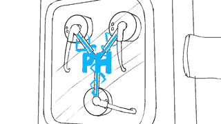
My group was assigned the film Back to the Future and the style of title sequence we are drawing from is the trailer for Typomad (Madrid Typography Festival.) The trailer is rather minimalist- relying on flat colours, simple shapes and patterns, animations and panning to reveal the initials of important people attending the event, so it was interesting to see how we could apply this to BttF and still make it interesting and recognizable.

Our leads initially decided on the idea of presenting schematics of iconic BttF technology on a workbench to reveal initials of the team members names in a similar fashion to the Typomad sequence, with appropriate 3D assets included in the shots. For the first week we were assigned the task of coming up with ideas on how the initials could be revealed. The schematic-based idea was having trouble gaining traction, which became very evident in week 2. Most of the ideas we came up with involved actual objects rather than schematics as they seemed to offer more varied and interesting ways to reveal the initials. At this stage the project still didn’t really have a direction, we have never had a face to face meeting with all of our team without at least two people missing, and we also didn’t realize that we were already supposed to have a storyboard ready to present in class. It was fair to say we were beginning to fall behind!

I asked if we could have a meeting with the members of the team that were there after that class, so we could nail down what ideas we came up with were actually going to be in our title sequence so a storyboard could be started along with allocating tasks. We didn’t manage to sort those things out during class time. I felt this helped us significantly in getting organised and actually commencing work on our project, especially for the people who could were there. We decided on including ideas that involved Marty’s hoverboard, a schematic of the Delorean, the Flux Capacitor and an alarm clock similar to the Hill Valley Clocktower, and we elected what we wanted to work on through the next week.

I chose to do the storyboards, which I decided to draw in flash to make animating the assets in the animatic easier. The process was very straight forward, I just made a new frame for each new shot in the storyboard and drew what was needed to be conveyed, but it took me a lot longer than I thought- about 6 hours, which wasn’t good for my 10 hour time limit. They were finished on Thursday, 1st of October.

storyboards

I got some feedback from my team members on slack of extra little things that could be included, so I added them in the animatic, which I’ll go over in my next post!

slack1

slack2

Elements of Design: Exercise 1

To kick off the beginning of my Studio 1 work, we were tasked with creating a style analysis of one of the characters from the show our group is using for the mobile character design project. The style my group is following is Alex Hirsch’s Gravity Falls, and the particular character I have chosen is Mabel Pines, as I wish to create a similar character for the project.

Mabel Pines

Mabel is one of the main characters on the show, and is overwhelmingly positive and energetic. She’s silly, loving, boy crazy and a self-proclaimed crafts master. Her knack for thinking outside of the box has saved herself and her twin brother Dipper from numerous dangerous encounters with the supernatural.

Point

Points found on Mabel include her pupils, bracers, and star on her sweater. All of these elements draw attention to important aspects of her design- Her wide big eyes, huge grin, and gaudy yet charming taste in childish sweaters.

Line

The lines used in Mabel’s design, like most characters in Gravity Falls, is quite thick and black, and there is very little variation in line weight. In Mabel’s Design in particular, almost all the lines are curved and there a very few places they form a sharp corner, which reflects her characteristic vibe of happiness and friendly nature. The lines used for her hair make it appear rather bushy in texture, as instead of tapering to a point they curve around to create a loop.

Shape

mabel shapes

Continuing the rounded theme, Mabel is almost exclusively composed of circles or ovals, as I have indicated in pink above. In character design, circles typically represent youth, gentleness, harmony and friendliness, which captures Mabel’s personality quite well.

Form

Like above, Mabel is mostly spheres when considered with depth, which also convey the general goodness of Mabel’s character. The blue rectangles however become cylinders in 3-dimensional space, which further supports the ’roundness’ of her design.

Texture

What little texture is conveyed is done so mostly through line, as the colors are flat and simple. The vertical lines in the collar of her sweater imply that it is kitted, which makes the viewer assume the rest of the sweater is also, while how it curves into a wide oval at the bottom implies the sweater is quite thick. As mentioned above, her hair appears bushy due to the looping of the lines.

Tone

mabel tone

Mabel is overall medium to light in tone, the lightest shades being her eyes, teeth and socks and the darkest being her shoes. Tone doesn’t really say much about her character design seeing as its so focused on bright, saturated colours

Colour

mabel colour

Mabel’s colour palette sports a variety of different vibrant hues from her clothes, which support her energetic, optimistic and naive nature. Overall, the colours used in her design are warm, which reflects her friendliness. Instead of using a pure red for her sweater, which could come across as aggressive, her design features a toned down, pinkish red, which still conveys her passion but in a gentler way. The colours used are very flat with no shading which adheres to the simple style of the show.

In conclusion, Mable’s character design and her personality support each other very well, from her roundness symbolizing her kindness to her sweaters representing her optimistic intensity and goofiness. Even through a simple style, a lot is conveyed about both Mable’s appearance and characterization.

Opening_mabel_pig