A little animation I’ve been working on in my free time. It was good practice for portraying weight as well as squash an stretch.

damn vegtables
A little animation I’ve been working on in my free time. It was good practice for portraying weight as well as squash an stretch.
damn vegtables
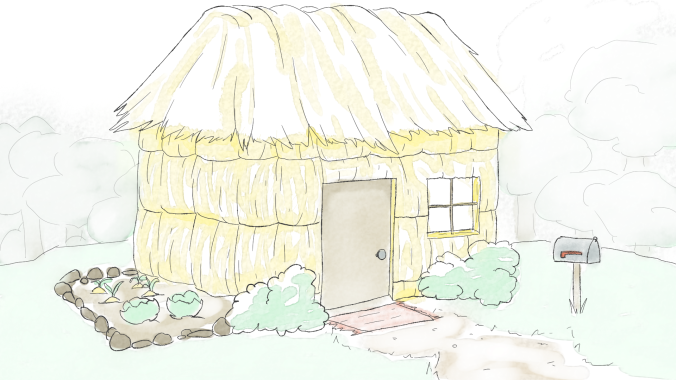
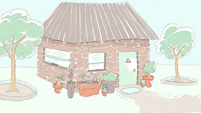
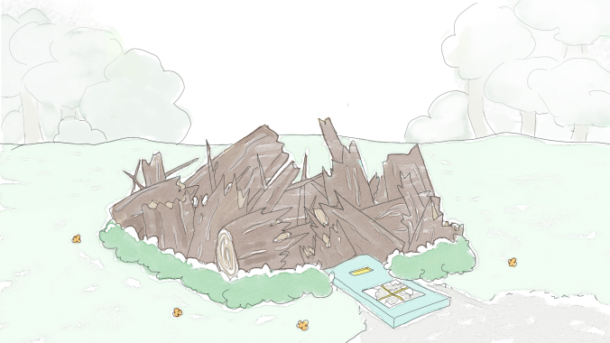
I’ve been working on a project with the graphic design students as a background artist for a digital animated storybook retelling of the Three Little Pigs. It’s a lot more straight forward than the Games project as all I am require to do is provide any need backgrounds in a watercolourly Peter Rabbit Style. This is what I’ve done so far


Several weeks ago I attended the games student’s pitches for their project and decided to join the Paper Titan team, who were working on a top down 2v2 party game called Titian Tussle. As the name suggests, the game revolves around wrestling titans, and it was our job to model, texture and animate those characters along with assets and an environment.
To begin with, we were tasked to create concept art for the characters and environment. We were brief that there should be two different kinds of characters: Large, slow titans who charged at enemies after a delay, and smaller titans who were faster and could stun enemies.

These are the rough concepts I made for the characters. I tried to make them all very unique but also recognizable as being from the same game.
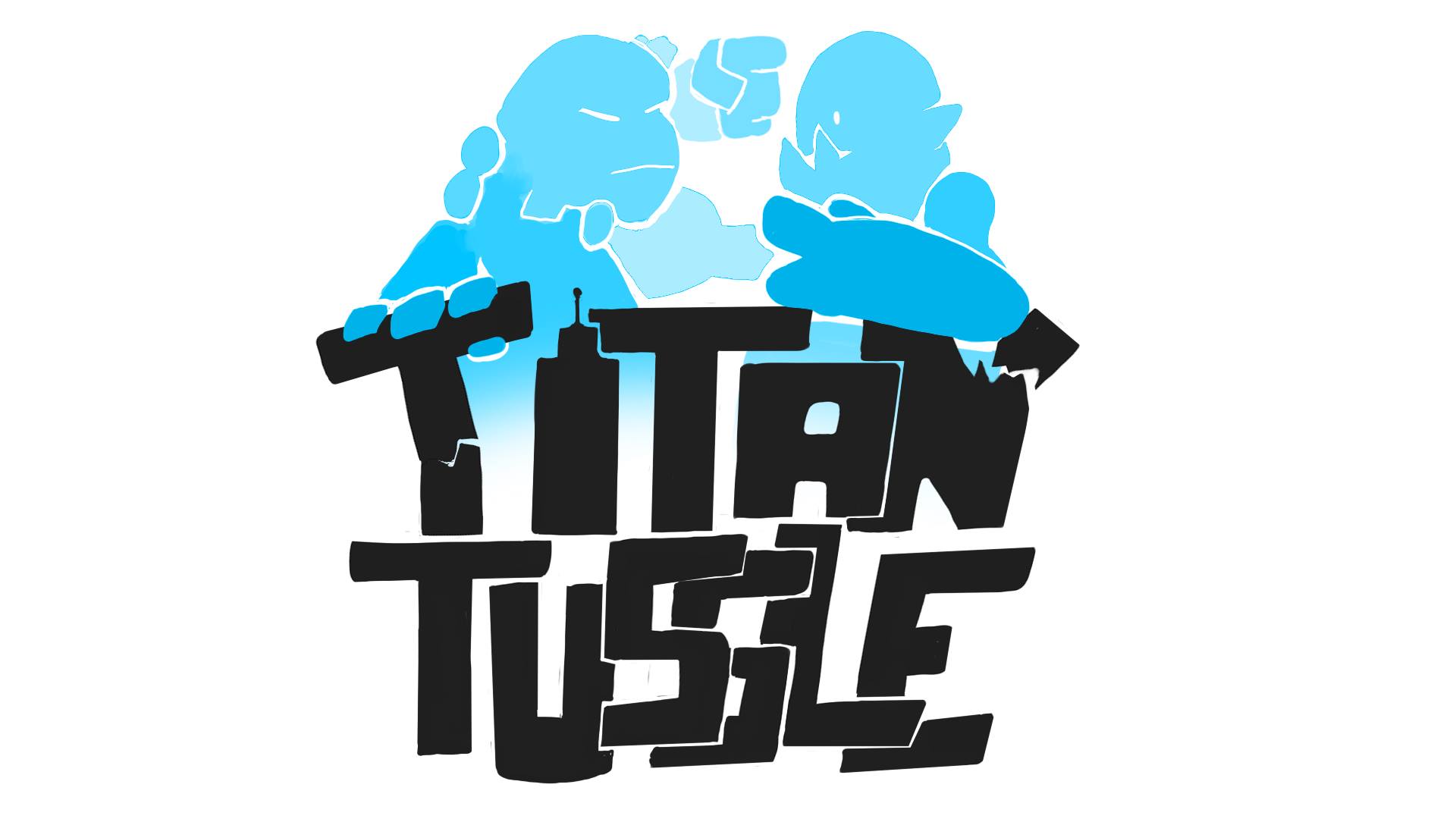
I was also asked to make a title/logo for the game and provide the layers I used for it so it could be animated, which I made sure to do.
About two weeks into the project we had a meeting on Skype to decide on what characters and environments were going to be used in the project. Initially, the games students wanted 8 characters in total (2 characters for each animator) ready for a play test in 6 days, but I expressed that I thought that would be completely out of scope seeing as we had our own projects to work on, and thankfully they cut the amount of characters back to 4, so we had one character each. I assigned myself to the titan with the tree on it’s head. We had a few technical specifications we had to adhere to: the models should be under 1000 polys and have 1024×1024 texture maps. I was also asked to create portraits for all of the chosen titans.


I made sure to keep the colors bright to suit the desired feel of the game, and gave the pairs contrasting colours in signature elements of their design to indicate the teams.
Having completed and animated characters by the play test was still a bit of a stretch, and we only managed to have the models ready. My model had 631 polys at this stage.
Over the next few weeks I worked on polishing my model, UV unwrapping, texturing, rigging, skinning and animating my character.


This is the refined model that was used in the game, with 845 polys, nicely below the limit. As it needed to be animated, I made sure to space the polys appropriately and added extra topology on the elbow, but I got it backwards on the knee and only realized when I started skinning! Typical me. I made sure to disguise it as much as possible while I was skinning, anyway.


I must admit (and I’m sure it’s clearly evident) I rushed the UVs! Seeing as we were using fairly flat colors to texture, I thought this stage would be the best place to save some time. I had a few issues with the automatic seams/edges, however. When I quick-peeled an island I manually created a seam for, if there were automatic seams within that island they would flatten as two or more separate islands. I worked around this by selecting the unwanted seams and trying out the stitch options and found that the custom stitch option worked the best.


The textures were pretty easy, as we only had to provide a flat colored diffuse. I added a speckled texture on the titans skin and painted the limbs to look like wood.
Next was creating the animations! We had no idea how to animate for games, so we asked a few of our facilitators and the game student facilitators who all gave us a few resources to look further into. After looking into these and consulting with the games students, we found setting up one scene with all the different animations along the timeline was the best way. Kynan organised it with the game students to film reference on the different movements they were after. These were put up on our dedicated google drive and I found it incredibly helpful (and entertaining) 
I created (in order for below) an idle, impact reaction, impact, dizzy, pushed back, fall, charge, and channel animations with the help of some documentation for allocating task and for indicating what frames each animation is on.


These are a bit faster than the actual animations used in the game because I got the frame rate wrong when exporting the gifs from photoshop.

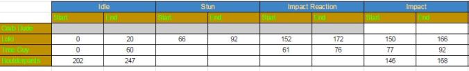
I found it difficult to apply the principals of animation to the movements as many of them had to be very fast or start immediately without slowing in as to not interfere with the pace of the game. Even so, I tried to included follow through and secondary animations on the limbs and head where appropriate.
Last of all we were asked to create some portraits for the credit screen in the game, and these were my two!


I am so happy with how the game turned out, it looks great and is really fun to play! We were really lucky to have such a good group of game students; they were really accommodating and gave us heaps of creative freedom as well as keeping us on track and aware of all the upcoming play tests and due dates. Not to mention they actually got it to work somehow! While stressful at times juggling it with two other projects, it was a really rewarding experience and I’m super proud of what we accomplished.
Since my last post, I got some feedback on my design from Katie prompting me to make Bailey’s gender more recognizable, so I added a few details like eyelashes, a frill to her nightdress and made her cheek fur curl upwards. Along with this it was suggested I make her tail lower give her some mane fur.
After this I also got some feedback from Martin who suggested I extend the line that indicated her cheek fur to make it appear more in front of the ear, and to break the line of her roll of fat. Another suggestion was to include another roll of fat lower on her belly, but I couldn’t that to look right, so I didn’t include it.
Here’s a before and after the feedback. I definitely think it improved the overall appeal of my character design.


After that I worked on the model sheet, and then I was ready to start modelling.


I didn’t take many screenshots of the process I took to create the model, but I used the box modelling method and made sure that I was being as efficient with my tris as possible. I really enjoyed having a limited amount of polys to play with, and I seemed to have a knack for it too. I only used 708 tris for the model, well under the limit of 1000. I really want to try this out again in the future!

Since we needed to pose this model for the project, we had to make sure the mesh was suitable to be deformed when skinned to a rig. I made sure to keeps the polys appropriately spaced and included extra topology on the elbow and finger joints so they keep their volume better when bent.

At this stage I asked my team for feedback and got a suggestion to make the model’s feet and eyes more rounded which I made sure to rectify. I added smoothing groups and then I was ready to unwrap the model.

I’m late making this blog post, as we had finished the project this time last week, but I’ll do my best to remember what got done since my last post for this project. It’s gonna be a long one, sorry!
During week 4, we focused on getting the assets completed with textures and finding how to get the right lighting and rendering settings to suit the look we we’re going for. My team members handled that more technical aspect really well and made sure all the assets were as complete as they could be. Unfortunately, we hit a bit of a roadblock when deciding and discussing on the limited colour palette we were going to use.
We had settled on this for a while, though after trying it out in a 3D scene it was brought to my attention that some of the shots didn’t look very good with so many bright colours. I received some feedback from Katie that I should have more balance in regard to saturation and value, and try out having a black background on the shots to make it more similar to the BttF logo. I played around with these ideas, though ultimately my team and I decided we found it too stark for the look we we’re going for.


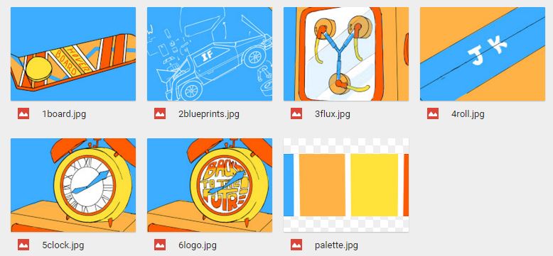
I expressed that I was having trouble with the colours to their team and asked them for suggestions, which I got plenty of along with some great ideas. Pat suggested to try out a pale grey background which I think really helped us to nail the colours. Here are some palettes I made following my team’s suggestions:


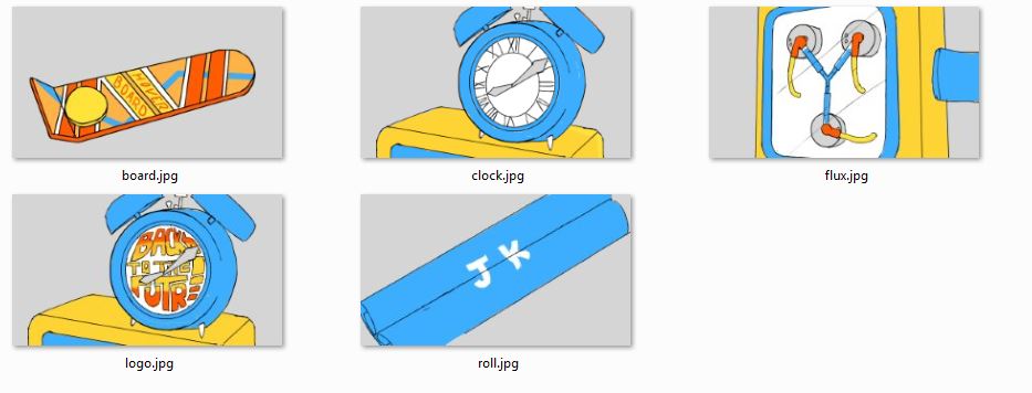 We still had difficulty deciding on the colour of the clock though. I wanted it to be blue to contrast with the logo, though a lot of the team liked it better orange. Eventually it was decided that the clock would be blue. Now all the assets could be textured according to the colour scheme.
I worked on unwrapping and texturing Pat’s hoverboard model. I ran into an issue pretty quick as when I downloaded and opened the file I was met with a fair few errors and it looked like this:

I couldn’t see that I was selecting anything and it just all round looked not right, so I sent a message through slack asking what was wrong. While waiting for a response, I tried exporting it as an .obj file and that solved all my problems, so I started unwrapping. Soon after I found out the reason it looked like that was because a few non-native lights were left in the scene, and all I had to do to fix it was delete those lights, so that was pretty dumb of me! I continued unwapping and texturing my .obj file, anyway. Since it’s a hard surface model and I only needed to do flat colours, I found the process pretty easy!


By the first day of week 5, time was starting to get away on us again. Thankfully, Izzy pushed for us to properly sort out the 3D scene and cameras ready for Tuesday, so it could be rendered out have animated text in time for class on Wednesday. I elected to handle the scene and cameras despite not having done anything of the sort before, so I ran into a fair few issues. I had the rough camera setup Ben provided which helped a lot with animating the cameras, though. It was especially frustrating trying to find where the right animation keys where and trying to get the timing right. I asked my team if there was any way to preview the animation in sequence, jumping from camera to camera, but I was told there wasn’t, so there was no real way to know if the timing and camera shots looked natural before rendering it out and editing the scenes together.
I gave my team members the scene file anyway for feedback, and got asked to move the hoverboard on top of the blueprint like it was in the animatic instead of off to the side as it was in Ben’s layout, as well as alter the ticking clock animations that one of my team members had done. After that I handed it over to Izzy for her to set up the lighting and render it out, then it was ready for Keeffe to add animations to the initials in After Effects.
In class on Wednesday I edited together the rough sequence using the work we had done over the past two days in premier so we had something to get feedback on. By this stage all that needed doing was to replace the text, refine some of the animations in After Effects and edit together the final sequence.
I wanted to try out editing Keeffe’s animations, so I downloaded his file to give it a go. I found out that instead of using paths, the animations for the text were done frame by frame, or as frame by frame as you could get in AE. The result was a hell of a lot of layers.
I wasn’t going to try editing that, so I remade a single layer of text for each set of initials and tried animating it them that way.
I found this a lot simpler. I just turned on the little keyframe diamonds and changed the position, scale and rotation to how I wanted them, when I wanted them. I repeated this for most of the sets on initials as well as editing the color of the ones on the flux capacitor. The resulting initials were still quite shaky and unstable, and I didn’t know how to fix that, though I think they were at least a small improvement from how they were before.
Last of all, I did the final edits, added the actor names, and imported music in premiere. I edited the timing slightly on the shots to sync better with the Back to the Future theme song, and we were done!
I’ll be honest, it was a kinda stressful and frustrating project, but I’m quite happy with what we achieved despite lacking documentation and two more experienced team members for the majority of the process. I also became much closer friends with the Studio 1 members of our team and I’d love to work with them again in the future. I’ll just try to make sure there are less hiccups next time!
