Texturing revisited

To tick of my final remaining learning outcome I’ve texture a model but go beyond simple diffuse textures, so I decide to add a normal map to the model I made for the games students.

I downloaded Nvidia’s texture tools for Photoshop, and after playing around with the settings I sort of got the hang of it. I felt however that the texture in the wood wasn’t deep enough when compared to the skin texture, so I upped the contrast of that part in the diffuse and applied the filter again and I though that looked better.

no normal.png

Before

normalrender.png

After

I like how it turned out with the wood indents, though I don’t like how much it exaggerated the texture on the body, though I suppose that’s kinda unavoidable with a process that’s as automatic as this.

detail.png

Talonflame animation and composite

Since I have lost the after effects files we worked on with Brett, I decided to try and composite an animation into a filmed environment. Not having time to make a model, I found a website that hosts rigged Pokemon characters ripped from the 3Ds games, and decided to use Talonflame to make a video in a similar style to the Pokemon GO trailer.

The idea was to have animated him to land on my balcony, so I looked up some animation reference of hawks, the animal Talonflame is based on.

This helped a lot, but I still feel my animation is pretty stiff! I found it really hard to guess how the landing should look and also folding the wings. (which the rigging really wasn’t suited to doing)

I had to learn a lot of things to make the animation look at least somewhat believable in the scene. My footage was really shaky, so I did a little research and learned of the warp stabilizer, which worked really well, but the camera still moved enough that I had to learn how to track movement and apply that to layers as well, which I did by applying the movement tacker to a null object and then parenting that to any layers that needed to follow the movement of the camera.

I made a track matte mask on a shape layer to make sure Talonflame didn’t pass over the top of the railings, but encountered a problem when he landed to them, as his toes needed to be visible. I worked around this by making a small white shape on the luma track matte layer and keyframed it to move down as he lands.

I also applied a grain effect to the talonflame animation to make it fit better with my low quality camera footage. Along with this, I made him lighter when he is furthest away and had it blend to his normal colors, then to darker colors as he flew under the roof. To finish off I added a small shadow where he lands on the railings and added his cry to where he opens his mouth.

I don’t think the finished product is very believable and there is still a lot of mistakes, but I’m still pretty happy with it being my first independent project in after effects.

Animation Obstacle Course

Our final project for Studio 1 is to animate a character navigating and obstacle course. Along with this, we also had to replicate the movement style of a character, and decide between doing 2D or 3d animation. I decided to do 2D animation and use Goofy as the style to follow.

Research and Planning


Goofy’s movement style is quite well summed up by his name. Acting is very important to his movement, as you will never see him animated in a way that isn’t clumsy or awkward. All of his movements are highly exaggerated and comical, and rely heavily on squash and stretch, heavy anticipation/buildup and slapstick. He takes large, loping strides and swings his body around wildly, and is quite limber. Goofy’s proportions are also quite essential to his movement, especially his large feet and long snout.

Keyframesroughwip.gif

This is my first pass. I tried to make the keyframes as goofy-like as possible, despite the drawings lacking his signature visual features, because at this stage I was expecting that I would have to use the Norman rig.

kryframes.gif

This version has a few changes after I got some feedback from Martin and Chris. They suggested making goofy have a more difficult, clumsy time, especially at the part where he has to jump from pole to pole and at the stairs at the end.

Breakdowns

breakdowns

I added a few extra frames in between the key frames to further help achieve the movements I was after. At this stage I found it easier to show any squash and stretch, arcs, slow in and out, and anticipation.

Here I replaced the rough key frames and breakdowns with some of the the final art I would use. I changed how Goofy broke the flag at the end from a suggestion of Martin’s and exaggerated the scramble up the wall at the poles because of Chris’ feedback.

Inbetweening

I added extra variations of symbols for the hands, face and feet to make it look more natural along with adding the inbetweens. At this stage I felt it was pretty much complete enough to be presented, so I exported it at the  required 16:9 aspect ratio at 25 frames per second, though I wish I had more time to add his ears!

Cross Discipline Project: Titan Tussle

Several weeks ago I attended the games student’s pitches for their project and decided to join the Paper Titan team, who were working on a top down 2v2 party game called Titian Tussle. As the name suggests, the game revolves around wrestling titans, and it was our job to model, texture and animate those characters along with assets and an environment.

To begin with, we were tasked to create concept art for the characters and environment. We were brief that there should be two different kinds of characters: Large, slow titans who charged at enemies after a delay, and smaller titans who were faster and could stun enemies.

Kate's Titian conceptsmore small titan concepts

These are the rough concepts I made for the characters. I tried to make them all very unique but also recognizable as being from the same game.

12116568_10206693671198203_2037286893_o

I was also asked to make a title/logo for the game and provide the layers I used for it so it could be animated, which I made sure to do.

About two weeks into the project we had a meeting on Skype to decide on what characters and environments were going to be used in the project. Initially, the games students wanted 8 characters in total (2 characters for each animator) ready for a play test in 6 days, but I expressed that I thought that would be completely out of scope seeing as we had our own projects to work on, and thankfully they cut the amount of characters back to 4, so we had one character each. I assigned myself to the titan with the tree on it’s head. We had a few technical specifications we had to adhere to: the models should be under 1000 polys and have 1024×1024 texture maps. I was also asked to create portraits for all of the chosen titans.

tree_babe bolder_pants crab_dude loki_doki

I made sure to keep the colors bright to suit the desired feel of the game, and gave the pairs contrasting colours in signature elements of their design to indicate the teams.

Having completed and animated characters by the play test was still a bit of a stretch, and we only managed to have the models ready. My model had 631 polys at this stage.treebabe wip model

Over the next few weeks I worked on polishing my model, UV unwrapping, texturing, rigging, skinning and animating my character.

treebabemodel animation topology

This is the refined model that was used in the game, with 845 polys, nicely below the limit. As it needed to be animated, I made sure to space the polys appropriately and added extra topology on the elbow, but I got it backwards on the knee and only realized when I started skinning! Typical me. I made sure to disguise it as much as possible while I was skinning, anyway.

UVmap UVunwarp

I must admit (and I’m sure it’s clearly evident) I rushed the UVs! Seeing as we were using fairly flat colors to texture, I thought this stage would be the best place to save some time. I had a few issues with the automatic seams/edges, however. When I quick-peeled an island I manually created a seam for, if there were automatic seams within that island they would flatten as two or more separate islands. I worked around this by selecting the unwanted seams and trying out the stitch options and found that the custom stitch option worked the best.

treeuvs texture

The textures were pretty easy, as we only had to provide a flat colored diffuse. I added a speckled texture on the titans skin and painted the limbs to look like wood.

Next was creating the animations! We had no idea how to animate for games, so we asked a few of our facilitators and the game student facilitators who all gave us a few resources to look further into. After looking into these and consulting with the games students, we found setting up one scene with all the different animations along the timeline was the best way. Kynan organised it with the game students to film reference on the different movements they were after. These were put up on our dedicated google drive and I found it incredibly helpful (and entertaining) refs.JPG

I created (in order for below)  an idle, impact reaction, impact, dizzy, pushed back, fall, charge, and channel animations with the help of some documentation for allocating task and for indicating what frames each animation is on.

Idleimpactreactionimpactdizzypushbackfallchargechannel

These are a bit faster than the actual animations used in the game because I got the frame rate wrong when exporting the gifs from photoshop.

task list.JPG

frames.JPG

I found it difficult to apply the principals of animation to the movements as many of them had to be very fast or start immediately without slowing in as to not interfere with the pace of the game. Even so, I tried to included follow through and secondary animations on the limbs and head where appropriate.

Last of all we were asked to create some portraits for the credit screen in the game, and these were my two!

Kate Portrait.jpgBen Portrait.jpg

I am so happy with how the game turned out, it looks great and is really fun to play! We were really lucky to have such a good group of game students; they were really accommodating and gave us heaps of creative freedom as well as keeping us on track and aware of all the upcoming play tests and due dates. Not to mention they actually got it to work somehow! While stressful at times juggling it with two other projects, it was a really rewarding experience and I’m super proud of what we accomplished.

Character Design Project: Post 2

Since my last post, I got some feedback on my design from Katie prompting me to make Bailey’s gender more recognizable, so I added a few details like eyelashes, a frill to her nightdress and made her cheek fur curl upwards. Along with this it was suggested I make her tail lower give her some mane fur.

After this I also got some feedback from Martin who suggested I extend the line that indicated her cheek fur to make it appear more in front of the ear, and to break the line of her roll of fat. Another suggestion was to include another roll of fat lower on her belly, but I couldn’t that to look right, so I didn’t include it.

Here’s a before and after the feedback. I definitely think it improved the overall appeal of my character design.

bailey bailey

After that I worked on the model sheet, and then I was ready to start modelling.bailey model sheet

box modellingbaileywip

I didn’t take many screenshots of the process I took to create the model, but I used the box modelling method and made sure that I was being as efficient with my tris as possible. I really enjoyed having a limited amount of polys to play with, and I seemed to have a knack for it too. I only used 708 tris for the model, well under the limit of 1000. I really want to try this out again in the future!

blep

Since we needed to pose this model for the project, we had to make sure the mesh was suitable to be deformed when skinned to a rig. I made sure to keeps the polys appropriately spaced and included extra topology on the elbow and finger joints so they keep their volume better when bent.

feedback

At this stage I asked my team for feedback and got a suggestion to make the model’s feet and eyes more rounded which I made sure to rectify. I added smoothing groups and then I was ready to unwrap the model.

after revision

Rapid Production Project: Post 3

Back to the Future & Typomad Title Sequence

Coming to a Close

I’m late making this blog post, as we had finished the project this time last week, but I’ll do my best to remember what got done since my last post for this project. It’s gonna be a long one, sorry!

During week 4, we focused on getting the assets completed with textures and finding how to get the right lighting and rendering settings to suit the look we we’re going for. My team members handled that more technical aspect really well and made sure all the assets were as complete as they could be. Unfortunately, we hit a bit of a roadblock when deciding and discussing on the limited colour palette we were going to use.

firstpalette

We had settled on this for a while, though after trying it out in a 3D scene it was brought to my attention that some of the shots didn’t look very good with so many bright colours. I received some feedback from Katie that I should have more balance in regard to saturation and value, and try out having a black background on the shots to make it more similar to the BttF logo. I played around with these ideas, though ultimately my team and I decided we found it too stark for the look we we’re going for.

flux4 flux

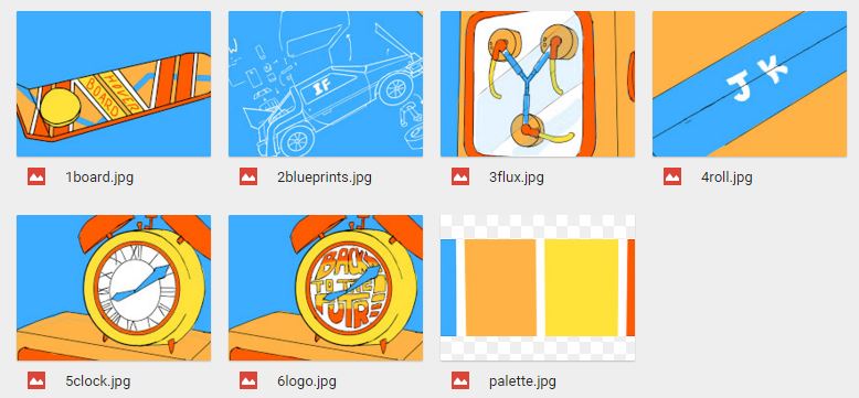
I expressed that I was having trouble with the colours to their team and asked them for suggestions, which I got plenty of along with some great ideas. Pat suggested to try out a pale grey background which I think really helped us to nail the colours. Here are some palettes I made following my team’s suggestions:

fixed grey bg grey_bgs_orangeclockedition Grey_bgs_yellowfluxeditionWe still had difficulty deciding on the colour of the clock though. I wanted it to be blue to contrast with the logo, though a lot of the team liked it better orange. Eventually it was decided that the clock would be blue. Now all the assets could be textured according to the colour scheme.

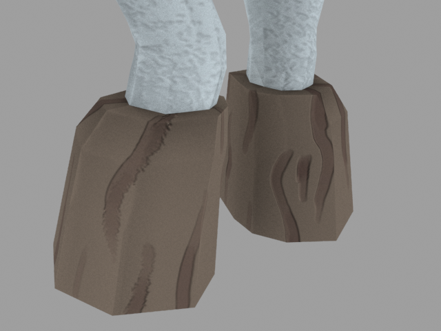
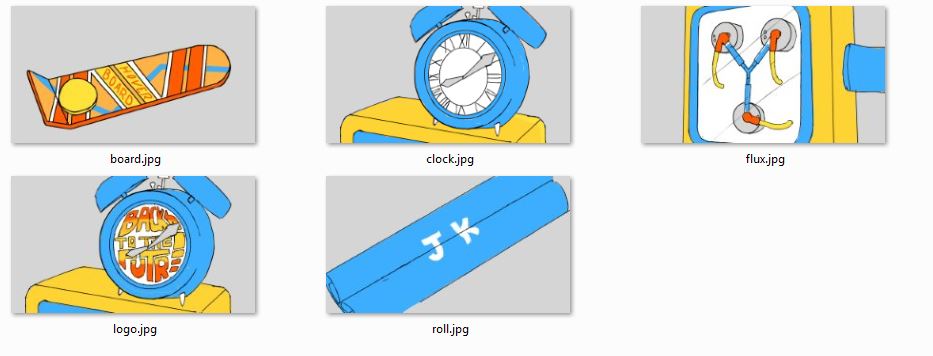
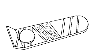
I worked on unwrapping and texturing Pat’s hoverboard model. I ran into an issue pretty quick as when I downloaded and opened the file I was met with a fair few errors and it looked like this:

um

I couldn’t see that I was selecting anything and it just all round looked not right, so I sent a message through slack asking what was wrong. While waiting for a response, I tried exporting it as an .obj file and that solved all my problems, so I started unwrapping. Soon after I found out the reason it looked like that was because a few non-native lights were left in the scene, and all I had to do to fix it was delete those lights, so that was pretty dumb of me! I continued unwapping and texturing my .obj file, anyway. Since it’s a hard surface model and I only needed to do flat colours, I found the process pretty easy!

uvsnyooom

Hoverboard_texture

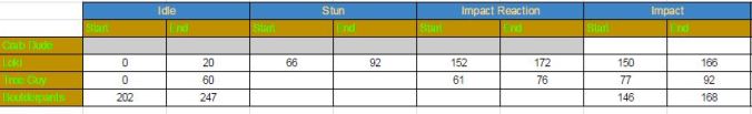
By the first day of week 5, time was starting to get away on us again. Thankfully, Izzy pushed for us to properly sort out the 3D scene and cameras ready for Tuesday, so it could be rendered out have animated text in time for class on Wednesday. I elected to handle the scene and cameras despite not having done anything of the sort before, so I ran into a fair few issues. I had the rough camera setup Ben provided which helped a lot with animating the cameras, though. It was especially frustrating trying to find where the right animation keys where and trying to get the timing right. I asked my team if there was any way to preview the animation in sequence, jumping from camera to camera, but I was told there wasn’t, so there was no real way to know if the timing and camera shots looked natural before rendering it out and editing the scenes together.the scene

I gave my team members the scene file anyway for feedback, and got asked to move the hoverboard on top of the blueprint like it was in the animatic instead of off to the side as it was in Ben’s layout, as well as alter the ticking clock animations that one of my team members had done. After that I handed it over to Izzy for her to set up the lighting and render it out, then it was ready for Keeffe to add animations to the initials in After Effects.

In class on Wednesday I edited together the rough sequence using the work we had done over the past two days in premier so we had something to get feedback on. By this stage all that needed doing was to replace the text, refine some of the animations in After Effects and edit together the final sequence.

I wanted to try out editing Keeffe’s animations, so I downloaded his file to give it a go. I found out that instead of using paths, the animations for the text were done frame by frame, or as frame by frame as you could get in AE. The result was a hell of a lot of layers.frame by frame

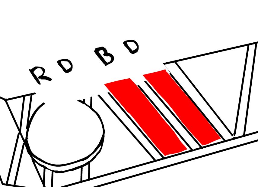
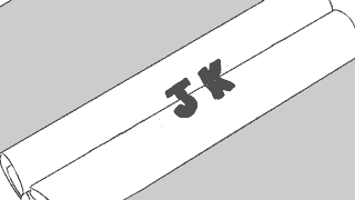
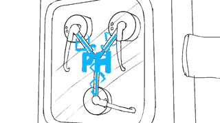
I wasn’t going to try editing that, so I remade a single layer of text for each set of initials and tried animating it them that way.paths

I found this a lot simpler. I just turned on the little keyframe diamonds and changed the position, scale and rotation to how I wanted them, when I wanted them. I repeated this for most of the sets on initials as well as editing the color of the ones on the flux capacitor. The resulting initials were still quite shaky and unstable, and I didn’t know how to fix that, though I think they were at least a small improvement from how they were before.

Last of all, I did the final edits, added the actor names, and imported music in premiere. I edited the timing slightly on the shots to sync better with the Back to the Future theme song, and we were done!

I’ll be honest, it was a kinda stressful and frustrating project, but I’m quite happy with what we achieved despite lacking documentation and two more experienced team members for the majority of the process. I also became much closer friends with the Studio 1 members of our team and I’d love to work with them again in the future. I’ll just try to make sure there are less hiccups next time!

Character Design Project: Post 1

For the character design project, all the Studio 1 students were split into 4 groups. The goal for this project is to create a 3D lineup of an entirely new cast of characters for a certain cartoon series that is being adapted into a spin-off mobile game. The characters we make have to be comprised of between 500-1000 triangles and two 256×256 pixel images for the texture.

The first task we were given as a group is to actually decide on what cartoon we would be following in this project, and we decided on Gravity Falls, which I was really happy with! Each member of the team decides on, designs, and models their own character.

We all told each other what kind of character we were going to design in week three, which was a bit later than the other teams because of a few of us (eg. me) didn’t share on slack what our ideas were, but after that we had a good idea of what everyone was tackling. I was still deciding between a werewolf or a child character at this stage, but after finding out a lot of people we doing small or child characters I chose the former for variety.

Next to do was some visual style research! Surprisingly, there’s actually not that many instances of wolves in Gravity Falls as of yet. The two examples I did find include Dipper being mauled by one, and Dipper forcefully dressed up as one. In the first image, the wolf is depicted as being browny-grey and very scruffy, with small, far apart yellow eyes. The second image tells us very little about the actual style of wolves in the show, but does give a good example of how to depict the texture of fur. Also I felt I needed more than one example.

Kate

For the thumbnails I concentrated mostly on the body shape on my werewolf, as I felt it should be wearing minimal clothes and have a very limited colour palette. In the middle section I was trying out the idea of having smal eyes like the example of the wolf above but I decide that simply didn’t look ‘human’ enough to be a warewolf, so from then on I used the typical close-set circular eyes that Gravity Falls uses on all it’s humanoid characters. I stared to explore possible personalities in the row of heads at the bottom. I like the idea of having a grumpy, sleepy werewolf, who would rather go back to bed and sleep the full moon off than run around and cause havoc in a forest.

I got some great feedback from my facilitators and peers when I presented these thumbnails to the class! It was suggested that I make my character chubby, add more features to emphasize the sleepiness of the character, and generally have a more fleshed out idea of the personality of my character, which I believe I have since done! The idea of creating the human form of this character was also brought up, which I plan to design fairly soon.

bailey sketches

Here a some preliminary sketches of Bailey, the drowsy warewolf! Bailey is of no danger to anyone, unless you wake her up. That’s when you run. Besides having a horrible temper when her beauty sleep is interrupted, when awake Bailey is very mild mannered, and it takes a lot to get an emotional response from her. While being fairly dull, she is quite generous, especially when she can make someone feel more comfortable. This makes her very suited to her job as school nurse at Gravity Falls High School.

bailey

a wolf in sheep clothing, geddit????

Rapid Production Project: Post 2

Back to the Future & Typomad Title Sequence

Faffing around in Flash

In this post I will mainly be talking about what I did to create the animatic, as well as the feedback we received for it during our week 3 presentation. I managed to use up 8 hours doing this animatic, as a considerable amount of this time was consumed by was experimentation, learning stuff, and trying to fix issues in Flash.  I feel like the end product is just a series of somewhat-disguised quick and dirty workarounds, but it serves it’s purpose! I really learnt a lot about Flash and it’s capabilities (and shortcomings!)

Hoverboard

The first scene involves the hoverboard, which the camera zooms in on. The text Hover Board is wiped off to be replaced with initials, an the same happens again with another set of initials. To begin with, I had no idea how I could achieve this due to one main factor: The hoverboard must be opaque/solid so the schematics can appear under it for the transition. The reason the opacity of the board was an issue was because I was planning on having the two strips on the hoverboard transparent so I could animate the initials underneath it. So I did some research and decided to use a mask to solve this problem, so the layer with the initials was on top of the board, but could only appear on the two strips.

Red indicates where the mask is

Red indicates where the mask is

The animations of the initials sliding in were done with a classic tween. It was super useful and time-saving throughout the whole of this task thanks to it’s simplicity. I also used a classic tween for the zoom after scaling the three layers up, and then again for when it flies off screen.

Blueprint

I was starting to get the hang of things in this scene! The ‘written’ initials were done frame by fame but working backwards- I drew the whole set of initials first and then erased bits frame by frame to make sure they turned out how I wanted them to. The initials that slide on through the window were again done with a mask and a classic tween. The blueprints rolling inwards I had quite a lot of trouble with. Actually making the scrolling up animation was as straight forward as the previous ones, but it was hiding the blueprints behind them that had me scratching my head. I considered continuing the trend of using masks to solve all my problems, but I came up with a lazier faster idea of just adding a solid shape behind the scroll in it’s symbol so it covered what was underneath it and I didn’t have to do any extra animation. I did the initials that meet in the center of the scrolls frame by frame but it happens so fast you can hardly tell anyway.

flux-capacitor

This is where I included Pats suggestion of using the scrolls to transition to the flux capacitor.

I immediately regretted the idea of adding solid shapes behind the scroll when I got to the beginning of this part. When the other scroll rolls quickly in, it’s supposed to wipe to the flux capacitor, but because I used a solid shape to hide the blueprints, this now got into the way of the transition to the flux capacitor if it was on a lower layer. Masks came to my rescue again, though I feel this was my most abusive use of them yet.

biggassmask

Check out this monstrosity

So again, I put the flux capacitor on a layer above the scrolls and added a mask which covered the entire stage, then tweened the mask to animate in time with the scrolls. I had to add the extra part on top because when I tried to pan upward to the clock, I discovered most of it was missing, and eventually realised it was because of this mask. For the speeding up lights in the flux capacitor I made a long line of blue dots that got closer together at one end to form a line, then applied a mask to it on the the glass tubes, then tweened the line moving toward the center. I repeated this for the other two tubes.

The lights without the mask

Next I tweened a pair of initials to ‘charge’ into existence by editing its opacity in the keyframes. My team leader wanted the flux capacitor to spark, so I added a semi-opaque white shape to fill the entire screen for a few seconds as a kind of lightning, which then fades out to a pair of new initials and a sparks, which is just two keyframes switching between each other.

clock

This is where I used Ben’s suggestion of having the clock hands continue spinning after the the wipe to the logo.

The last scene is the clock, which after ticking forward the hands wipe backwards quickly to reveal the Back to the Future logo on the clock face. I couldn’t think of a way to achieve this effect without revealing the logo frame by frame besides shape tweening a mask, so I decided to try that out after animating the hands of the clock.

shapeteen

I learned that shape tweens are very… interesting. I played around with them a bit and found out I got the best result when the keyframes of the shape tween didn’t have a drastic change between them and also when the shape itself had fewer nodes. It still came out pretty wonky.

Overall my team was happy with it which was good! Unfortunately I forgot all about adding music for our presentation on Wednesday but we got some really good feedback. It was suggested to us to include more motion/panning in the shots and to make the sequence slightly longer, both of which we have done since! However, this makes the animatic slightly obsolete, but we have stuck for the most part with the animations for the initials shown above, while the shots and layout were set up in a 3DS Max scene file by Ben, which is available to all the team members.

On an unreleated note I now know how to import an image sequence into photoshop and export it as a gif thanks to having to learn how to do that for this post.

Rapid Production Project: Post 1

Back to the Future & Typomad Title Sequence

Getting shit sorted

The first project in Studio 1 is to create a title sequence for a film that is being rebooted into a television show in teams. This title sequence is to emulate the style of another particular title sequence. It’s being made in a very short time frame (5 weeks) with each team member only allowed to put in 10 hours per week.

My group was assigned the film Back to the Future and the style of title sequence we are drawing from is the trailer for Typomad (Madrid Typography Festival.) The trailer is rather minimalist- relying on flat colours, simple shapes and patterns, animations and panning to reveal the initials of important people attending the event, so it was interesting to see how we could apply this to BttF and still make it interesting and recognizable.

Our leads initially decided on the idea of presenting schematics of iconic BttF technology on a workbench to reveal initials of the team members names in a similar fashion to the Typomad sequence, with appropriate 3D assets included in the shots. For the first week we were assigned the task of coming up with ideas on how the initials could be revealed. The schematic-based idea was having trouble gaining traction, which became very evident in week 2. Most of the ideas we came up with involved actual objects rather than schematics as they seemed to offer more varied and interesting ways to reveal the initials. At this stage the project still didn’t really have a direction, we have never had a face to face meeting with all of our team without at least two people missing, and we also didn’t realize that we were already supposed to have a storyboard ready to present in class. It was fair to say we were beginning to fall behind!

I asked if we could have a meeting with the members of the team that were there after that class, so we could nail down what ideas we came up with were actually going to be in our title sequence so a storyboard could be started along with allocating tasks. We didn’t manage to sort those things out during class time. I felt this helped us significantly in getting organised and actually commencing work on our project, especially for the people who could were there. We decided on including ideas that involved Marty’s hoverboard, a schematic of the Delorean, the Flux Capacitor and an alarm clock similar to the Hill Valley Clocktower, and we elected what we wanted to work on through the next week.

I chose to do the storyboards, which I decided to draw in flash to make animating the assets in the animatic easier. The process was very straight forward, I just made a new frame for each new shot in the storyboard and drew what was needed to be conveyed, but it took me a lot longer than I thought- about 6 hours, which wasn’t good for my 10 hour time limit. They were finished on Thursday, 1st of October.

storyboards

I got some feedback from my team members on slack of extra little things that could be included, so I added them in the animatic, which I’ll go over in my next post!

slack1

slack2