Back to the Future & Typomad Title Sequence
Faffing around in Flash
In this post I will mainly be talking about what I did to create the animatic, as well as the feedback we received for it during our week 3 presentation. I managed to use up 8 hours doing this animatic, as a considerable amount of this time was consumed by was experimentation, learning stuff, and trying to fix issues in Flash. I feel like the end product is just a series of somewhat-disguised quick and dirty workarounds, but it serves it’s purpose! I really learnt a lot about Flash and it’s capabilities (and shortcomings!)
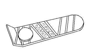
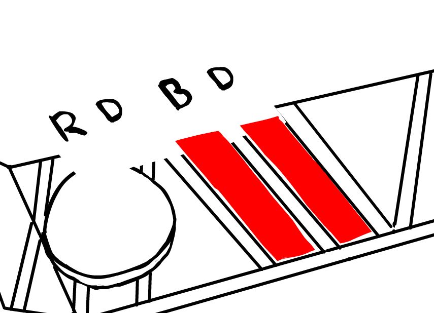
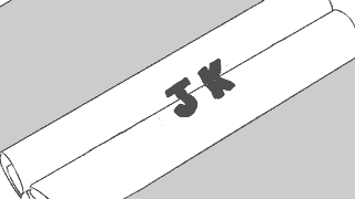
The first scene involves the hoverboard, which the camera zooms in on. The text Hover Board is wiped off to be replaced with initials, an the same happens again with another set of initials. To begin with, I had no idea how I could achieve this due to one main factor: The hoverboard must be opaque/solid so the schematics can appear under it for the transition. The reason the opacity of the board was an issue was because I was planning on having the two strips on the hoverboard transparent so I could animate the initials underneath it. So I did some research and decided to use a mask to solve this problem, so the layer with the initials was on top of the board, but could only appear on the two strips.

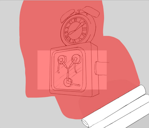
Red indicates where the mask is
The animations of the initials sliding in were done with a classic tween. It was super useful and time-saving throughout the whole of this task thanks to it’s simplicity. I also used a classic tween for the zoom after scaling the three layers up, and then again for when it flies off screen.
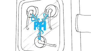
I was starting to get the hang of things in this scene! The ‘written’ initials were done frame by fame but working backwards- I drew the whole set of initials first and then erased bits frame by frame to make sure they turned out how I wanted them to. The initials that slide on through the window were again done with a mask and a classic tween. The blueprints rolling inwards I had quite a lot of trouble with. Actually making the scrolling up animation was as straight forward as the previous ones, but it was hiding the blueprints behind them that had me scratching my head. I considered continuing the trend of using masks to solve all my problems, but I came up with a lazier faster idea of just adding a solid shape behind the scroll in it’s symbol so it covered what was underneath it and I didn’t have to do any extra animation. I did the initials that meet in the center of the scrolls frame by frame but it happens so fast you can hardly tell anyway.

This is where I included Pats suggestion of using the scrolls to transition to the flux capacitor.
I immediately regretted the idea of adding solid shapes behind the scroll when I got to the beginning of this part. When the other scroll rolls quickly in, it’s supposed to wipe to the flux capacitor, but because I used a solid shape to hide the blueprints, this now got into the way of the transition to the flux capacitor if it was on a lower layer. Masks came to my rescue again, though I feel this was my most abusive use of them yet.
Check out this monstrosity
So again, I put the flux capacitor on a layer above the scrolls and added a mask which covered the entire stage, then tweened the mask to animate in time with the scrolls. I had to add the extra part on top because when I tried to pan upward to the clock, I discovered most of it was missing, and eventually realised it was because of this mask. For the speeding up lights in the flux capacitor I made a long line of blue dots that got closer together at one end to form a line, then applied a mask to it on the the glass tubes, then tweened the line moving toward the center. I repeated this for the other two tubes.

The lights without the mask
Next I tweened a pair of initials to ‘charge’ into existence by editing its opacity in the keyframes. My team leader wanted the flux capacitor to spark, so I added a semi-opaque white shape to fill the entire screen for a few seconds as a kind of lightning, which then fades out to a pair of new initials and a sparks, which is just two keyframes switching between each other.

This is where I used Ben’s suggestion of having the clock hands continue spinning after the the wipe to the logo.
The last scene is the clock, which after ticking forward the hands wipe backwards quickly to reveal the Back to the Future logo on the clock face. I couldn’t think of a way to achieve this effect without revealing the logo frame by frame besides shape tweening a mask, so I decided to try that out after animating the hands of the clock.

I learned that shape tweens are very… interesting. I played around with them a bit and found out I got the best result when the keyframes of the shape tween didn’t have a drastic change between them and also when the shape itself had fewer nodes. It still came out pretty wonky.
Overall my team was happy with it which was good! Unfortunately I forgot all about adding music for our presentation on Wednesday but we got some really good feedback. It was suggested to us to include more motion/panning in the shots and to make the sequence slightly longer, both of which we have done since! However, this makes the animatic slightly obsolete, but we have stuck for the most part with the animations for the initials shown above, while the shots and layout were set up in a 3DS Max scene file by Ben, which is available to all the team members.
On an unreleated note I now know how to import an image sequence into photoshop and export it as a gif thanks to having to learn how to do that for this post.