Rapid Reboot Project Post Mortem

Tidal wave of blog posts incoming! Really should have done this earlier, whoopsies. Lets see how much I can remember.

The rapid project for this trimester was to create a short teaser trailer for a classic video game. As usual we had a time budget of 10 hours a week as well as randomly generated specifications. Our group generated the games Jazz Jackrabbit and Monkey Island and the teaser styles Environment fly through and music video. In hindsight we really should have asked for another roll on the game choices as none of us were familiar with either of those games, but we ended up deciding on Monkey Island in an environmental fly through style.

hqdefault

It was decided pretty early that we would do the project in 2D seeing as most of the team said they were more competent with drawing than modeling. Our initial plan was to make flat illustrations and zoom out through the various scenes, starting in a building and then resolving with a wide shot of the Island. I made some rough color keys/environment concepts after doing some research into the locations in the game.

jail.png

The Jail on Melee Island

church.png

Outside the jail with the church to the right

island (1).png

Shot of the whole of Melee island

We pitched this idea and provided a storyboard and received some criticism that our teaser wouldn’t be capturing the essence of the original Monkey Island game, which I agreed with and really should have pushed my team more to take it into consideration. I think as a team we really needed to become more familiar with game as a whole instead of just jumping to conclusions about what it was about, which definitely isn’t the right way to appeal to fans of the series and create an effective trailer. (ANM220.LO19: Work objectively towards a common goal by giving constructive criticism and applying feedback, ANM220.LO12 Evaluate the effectiveness of production processes undertaken)

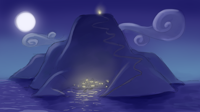
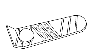
I was asked to create a vertical slice quite early in the project to show what the final project would look like.

verticle-slice.png

I made sure apply some visual fundamentals with this piece as it was supposed to represent the final quality of the project! Colour theory, lighting and values were things I relied on to keep the illustration interesting as the jail was quite dull, composed entirely of browns and blacks, so I made sure to have enough contrast between all those things, like the blue shadows and the orange of the firelight. There’s no fire in the scene because it was going to be added in after effects. (ANM220.LO10 Combine elements with consideration of visual fundamentals to produce aesthetically cohesive work)

I made sure to keep the image size large because the camera would be zooming through the image and if I didn’t you would likely see pixels in the final product. I was also asked to keep different elements on separate layers in case they needed to be animated in after effects to create a better sense of the camera moving through the illustration. (ANM220.LO.11 Output work that conforms to technical specifications required for the chosen medium)

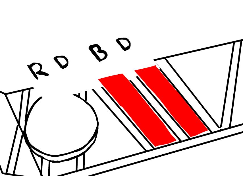
We had a change in the production method about halfway through our project, which required a few of the assets we had already done to be heavily modified and ended up increasing the workload for a few team members. We were asked to separate the background we had already done into separate images and remove any lighting we had painted in so the environment could be built in 3D in after effects using cards and have the lighting applied in there. I really should have shared my thoughts on it more as I felt it was a bit of a risk so late in the project and took some of control I had over what my art looked like in the final product away.

So I split up and reduced the lighting I had done in the jail scene. All our assets were kept convieniently on Google Drive And we communicated on Slack, though we would have benefited a lot more from more exhaustive documentation and a more fleshed out assets list, which I really should have helped out with. (ANM220.LO17 Implement & maintain technical frameworks that allow for collaborative production)

jail split.PNG

Here are the rest of the assets I made for the project!islandlayers

Town backdrop

buildingfront.png

buildingside

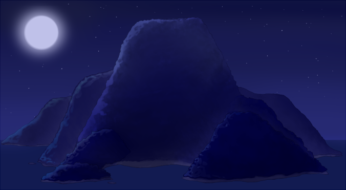
And the final product in which we asked some audio students to create a backing track to fit the video. It turned out they had a few issues we had no idea about, so we probably should have prompted them to communicate more or added the to our slack. (ANM220.LO02 Effectively integrate sound with animation.)

I’m not entirely happy with the final product but we did get in on time and to the brief’s specification, that being a teaser of our designated game and style that was between 15-30 seconds.

(ANM220.LO15 Produce work on time and within scope by engaging appropriate project management methodologies) 

(ANM220.LO16 Operate in a production environment to conceive, create, and implement creative productions) 

(ANM220.LO18 Interpret a brief and deliver a product to a client’s specification)


Rapid Production Project: Post 3

Back to the Future & Typomad Title Sequence

Coming to a Close

I’m late making this blog post, as we had finished the project this time last week, but I’ll do my best to remember what got done since my last post for this project. It’s gonna be a long one, sorry!

During week 4, we focused on getting the assets completed with textures and finding how to get the right lighting and rendering settings to suit the look we we’re going for. My team members handled that more technical aspect really well and made sure all the assets were as complete as they could be. Unfortunately, we hit a bit of a roadblock when deciding and discussing on the limited colour palette we were going to use.

firstpalette

We had settled on this for a while, though after trying it out in a 3D scene it was brought to my attention that some of the shots didn’t look very good with so many bright colours. I received some feedback from Katie that I should have more balance in regard to saturation and value, and try out having a black background on the shots to make it more similar to the BttF logo. I played around with these ideas, though ultimately my team and I decided we found it too stark for the look we we’re going for.

flux4 flux

I expressed that I was having trouble with the colours to their team and asked them for suggestions, which I got plenty of along with some great ideas. Pat suggested to try out a pale grey background which I think really helped us to nail the colours. Here are some palettes I made following my team’s suggestions:

fixed grey bg grey_bgs_orangeclockedition Grey_bgs_yellowfluxeditionWe still had difficulty deciding on the colour of the clock though. I wanted it to be blue to contrast with the logo, though a lot of the team liked it better orange. Eventually it was decided that the clock would be blue. Now all the assets could be textured according to the colour scheme.

I worked on unwrapping and texturing Pat’s hoverboard model. I ran into an issue pretty quick as when I downloaded and opened the file I was met with a fair few errors and it looked like this:

um

I couldn’t see that I was selecting anything and it just all round looked not right, so I sent a message through slack asking what was wrong. While waiting for a response, I tried exporting it as an .obj file and that solved all my problems, so I started unwrapping. Soon after I found out the reason it looked like that was because a few non-native lights were left in the scene, and all I had to do to fix it was delete those lights, so that was pretty dumb of me! I continued unwapping and texturing my .obj file, anyway. Since it’s a hard surface model and I only needed to do flat colours, I found the process pretty easy!

uvsnyooom

Hoverboard_texture

By the first day of week 5, time was starting to get away on us again. Thankfully, Izzy pushed for us to properly sort out the 3D scene and cameras ready for Tuesday, so it could be rendered out have animated text in time for class on Wednesday. I elected to handle the scene and cameras despite not having done anything of the sort before, so I ran into a fair few issues. I had the rough camera setup Ben provided which helped a lot with animating the cameras, though. It was especially frustrating trying to find where the right animation keys where and trying to get the timing right. I asked my team if there was any way to preview the animation in sequence, jumping from camera to camera, but I was told there wasn’t, so there was no real way to know if the timing and camera shots looked natural before rendering it out and editing the scenes together.the scene

I gave my team members the scene file anyway for feedback, and got asked to move the hoverboard on top of the blueprint like it was in the animatic instead of off to the side as it was in Ben’s layout, as well as alter the ticking clock animations that one of my team members had done. After that I handed it over to Izzy for her to set up the lighting and render it out, then it was ready for Keeffe to add animations to the initials in After Effects.

In class on Wednesday I edited together the rough sequence using the work we had done over the past two days in premier so we had something to get feedback on. By this stage all that needed doing was to replace the text, refine some of the animations in After Effects and edit together the final sequence.

I wanted to try out editing Keeffe’s animations, so I downloaded his file to give it a go. I found out that instead of using paths, the animations for the text were done frame by frame, or as frame by frame as you could get in AE. The result was a hell of a lot of layers.frame by frame

I wasn’t going to try editing that, so I remade a single layer of text for each set of initials and tried animating it them that way.paths

I found this a lot simpler. I just turned on the little keyframe diamonds and changed the position, scale and rotation to how I wanted them, when I wanted them. I repeated this for most of the sets on initials as well as editing the color of the ones on the flux capacitor. The resulting initials were still quite shaky and unstable, and I didn’t know how to fix that, though I think they were at least a small improvement from how they were before.

Last of all, I did the final edits, added the actor names, and imported music in premiere. I edited the timing slightly on the shots to sync better with the Back to the Future theme song, and we were done!

I’ll be honest, it was a kinda stressful and frustrating project, but I’m quite happy with what we achieved despite lacking documentation and two more experienced team members for the majority of the process. I also became much closer friends with the Studio 1 members of our team and I’d love to work with them again in the future. I’ll just try to make sure there are less hiccups next time!

Rapid Production Project: Post 2

Back to the Future & Typomad Title Sequence

Faffing around in Flash

In this post I will mainly be talking about what I did to create the animatic, as well as the feedback we received for it during our week 3 presentation. I managed to use up 8 hours doing this animatic, as a considerable amount of this time was consumed by was experimentation, learning stuff, and trying to fix issues in Flash.  I feel like the end product is just a series of somewhat-disguised quick and dirty workarounds, but it serves it’s purpose! I really learnt a lot about Flash and it’s capabilities (and shortcomings!)

Hoverboard

The first scene involves the hoverboard, which the camera zooms in on. The text Hover Board is wiped off to be replaced with initials, an the same happens again with another set of initials. To begin with, I had no idea how I could achieve this due to one main factor: The hoverboard must be opaque/solid so the schematics can appear under it for the transition. The reason the opacity of the board was an issue was because I was planning on having the two strips on the hoverboard transparent so I could animate the initials underneath it. So I did some research and decided to use a mask to solve this problem, so the layer with the initials was on top of the board, but could only appear on the two strips.

Red indicates where the mask is

Red indicates where the mask is

The animations of the initials sliding in were done with a classic tween. It was super useful and time-saving throughout the whole of this task thanks to it’s simplicity. I also used a classic tween for the zoom after scaling the three layers up, and then again for when it flies off screen.

Blueprint

I was starting to get the hang of things in this scene! The ‘written’ initials were done frame by fame but working backwards- I drew the whole set of initials first and then erased bits frame by frame to make sure they turned out how I wanted them to. The initials that slide on through the window were again done with a mask and a classic tween. The blueprints rolling inwards I had quite a lot of trouble with. Actually making the scrolling up animation was as straight forward as the previous ones, but it was hiding the blueprints behind them that had me scratching my head. I considered continuing the trend of using masks to solve all my problems, but I came up with a lazier faster idea of just adding a solid shape behind the scroll in it’s symbol so it covered what was underneath it and I didn’t have to do any extra animation. I did the initials that meet in the center of the scrolls frame by frame but it happens so fast you can hardly tell anyway.

flux-capacitor

This is where I included Pats suggestion of using the scrolls to transition to the flux capacitor.

I immediately regretted the idea of adding solid shapes behind the scroll when I got to the beginning of this part. When the other scroll rolls quickly in, it’s supposed to wipe to the flux capacitor, but because I used a solid shape to hide the blueprints, this now got into the way of the transition to the flux capacitor if it was on a lower layer. Masks came to my rescue again, though I feel this was my most abusive use of them yet.

biggassmask

Check out this monstrosity

So again, I put the flux capacitor on a layer above the scrolls and added a mask which covered the entire stage, then tweened the mask to animate in time with the scrolls. I had to add the extra part on top because when I tried to pan upward to the clock, I discovered most of it was missing, and eventually realised it was because of this mask. For the speeding up lights in the flux capacitor I made a long line of blue dots that got closer together at one end to form a line, then applied a mask to it on the the glass tubes, then tweened the line moving toward the center. I repeated this for the other two tubes.

The lights without the mask

Next I tweened a pair of initials to ‘charge’ into existence by editing its opacity in the keyframes. My team leader wanted the flux capacitor to spark, so I added a semi-opaque white shape to fill the entire screen for a few seconds as a kind of lightning, which then fades out to a pair of new initials and a sparks, which is just two keyframes switching between each other.

clock

This is where I used Ben’s suggestion of having the clock hands continue spinning after the the wipe to the logo.

The last scene is the clock, which after ticking forward the hands wipe backwards quickly to reveal the Back to the Future logo on the clock face. I couldn’t think of a way to achieve this effect without revealing the logo frame by frame besides shape tweening a mask, so I decided to try that out after animating the hands of the clock.

shapeteen

I learned that shape tweens are very… interesting. I played around with them a bit and found out I got the best result when the keyframes of the shape tween didn’t have a drastic change between them and also when the shape itself had fewer nodes. It still came out pretty wonky.

Overall my team was happy with it which was good! Unfortunately I forgot all about adding music for our presentation on Wednesday but we got some really good feedback. It was suggested to us to include more motion/panning in the shots and to make the sequence slightly longer, both of which we have done since! However, this makes the animatic slightly obsolete, but we have stuck for the most part with the animations for the initials shown above, while the shots and layout were set up in a 3DS Max scene file by Ben, which is available to all the team members.

On an unreleated note I now know how to import an image sequence into photoshop and export it as a gif thanks to having to learn how to do that for this post.

Rapid Production Project: Post 1

Back to the Future & Typomad Title Sequence

Getting shit sorted

The first project in Studio 1 is to create a title sequence for a film that is being rebooted into a television show in teams. This title sequence is to emulate the style of another particular title sequence. It’s being made in a very short time frame (5 weeks) with each team member only allowed to put in 10 hours per week.

My group was assigned the film Back to the Future and the style of title sequence we are drawing from is the trailer for Typomad (Madrid Typography Festival.) The trailer is rather minimalist- relying on flat colours, simple shapes and patterns, animations and panning to reveal the initials of important people attending the event, so it was interesting to see how we could apply this to BttF and still make it interesting and recognizable.

Our leads initially decided on the idea of presenting schematics of iconic BttF technology on a workbench to reveal initials of the team members names in a similar fashion to the Typomad sequence, with appropriate 3D assets included in the shots. For the first week we were assigned the task of coming up with ideas on how the initials could be revealed. The schematic-based idea was having trouble gaining traction, which became very evident in week 2. Most of the ideas we came up with involved actual objects rather than schematics as they seemed to offer more varied and interesting ways to reveal the initials. At this stage the project still didn’t really have a direction, we have never had a face to face meeting with all of our team without at least two people missing, and we also didn’t realize that we were already supposed to have a storyboard ready to present in class. It was fair to say we were beginning to fall behind!

I asked if we could have a meeting with the members of the team that were there after that class, so we could nail down what ideas we came up with were actually going to be in our title sequence so a storyboard could be started along with allocating tasks. We didn’t manage to sort those things out during class time. I felt this helped us significantly in getting organised and actually commencing work on our project, especially for the people who could were there. We decided on including ideas that involved Marty’s hoverboard, a schematic of the Delorean, the Flux Capacitor and an alarm clock similar to the Hill Valley Clocktower, and we elected what we wanted to work on through the next week.

I chose to do the storyboards, which I decided to draw in flash to make animating the assets in the animatic easier. The process was very straight forward, I just made a new frame for each new shot in the storyboard and drew what was needed to be conveyed, but it took me a lot longer than I thought- about 6 hours, which wasn’t good for my 10 hour time limit. They were finished on Thursday, 1st of October.

storyboards

I got some feedback from my team members on slack of extra little things that could be included, so I added them in the animatic, which I’ll go over in my next post!

slack1

slack2